Understanding colours
Do you notice the colours around you?

If you do, you must have some colour preferences for yourself. But why we happen to like or dislike certain colours? If we are choosy then it clearly means that it affects our mood, which in turn affects our decision making.
In a study conducted by the University of Winnipeg, it was found that approximately 62–90 per cent of the assessment is based on colours alone.
The world is swimming in the flood of content. Practically, most of the time people scan rather than going to details. The decision-making process takes around 90 seconds after the initial interaction with the product. Given the conditions, we have to acknowledge the importance of colours in any UI/UX design.
Colours play an important role in making your product noticeable among rivals, shaping the emotions of your users, and hence develop the desired feeling about your product.
In this series of articles, we will try to understand colours and how to use them properly. The concepts are generic and apply everywhere, from decorating your house to designing your website. Please keep in mind that the meaning of colours is subjective up to some extent. So the same colour can set different moods for different people. This does not mean that every person is different. These semantics mostly gets transcended from the culture and society of the subject. So, before applying any of the below techniques, make sure you spend some time studying the demographics of your target users. Don’t try to build for everyone, or you will end up building for no one. However, the underlying concepts apply everywhere.
Rather than jumping into boring theory, let’s start by looking at some pictures first and try to understand the differences. Then we can easily draw conclusions with a fair level of accuracy.

Focus on the picture for a minute. It uses very bright and highly saturated colours.
How does it feel? It looks artificial, eyes are not drawn to anything specific, and difficult to look at it for a long duration. Definitely, if you want to generate a sense of trust and make users spend time with your product, this is not the road to take.
Now let’s contrast it with the less saturated image below.

It looks more soothing to the eyes and projects a comfy mood.
But wait, bright saturated colours are not always bad. It can be useful if used in the right way.

Look at this image. This looks artificial, but in the case of cartoons, it works in our favour. Highly saturated and bright colours can make the users immediately note something which is actually fake and it really goes with its surreal unrealistic qualities.
Saturation and brightness can also be used to convey the emotions and mood of the environment and characters in the scene.

When the movie starts, as shown on the left, a lot of bright, saturated, fluorescent and vibrant colours have been used. This depicts the joyous and enthusiastic moments of the characters.
But later on, the situation changes and everyone becomes sad. The image that you see on the right has a lot of greys. Everything has been desaturated and it gives us a sense of sadness and agony in the lives of the characters.

If you have played mission games, specially themed around the world war, they also use a lot of grey shades in the scene.
Can you guess the reason now?
A pinch of saturated colour in the scene/UI also acts as an anchor for the eyes of the viewer and the viewer navigates the rest of the scene from that anchor. That is the reason why you should never overuse your primary colours in the scene, it uses it just for the primary CTA of the page.
As you have seen the impact of saturation and brightness already, its time to dive a bit deeper and understand hue, saturation and brightness.

Hue describes the pure spectrum colour: red, yellow, purple, blue, etc. Hue is a degree on the colour wheel (from 0 to 360o) where 0 (or 360) is red, 120 is green, 240 is blue.
Chroma, or saturation, may be defined as the dominance of the hue. Pure colours are fully saturated. Chroma is also a percentage value: 0% means a shade of grey and 100% is the full colour.
Value, or brightness, shows the overall intensity. It is the only component of colour that may exist by itself. Lightness is measured as a percentage: 0% is black, 100% is white.
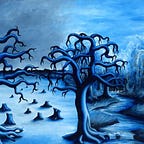
By changing the value of saturation and brightness of a single colour, you can create a palette of colours and do really amazing things.
For example, the painting below only uses the variations of blue, but the result is amazing.

If this read was worthy, please send some applauds.
In the continuation of this topic, in the next article, we will discuss colour moods, how to choose colours as per the nature of your business and what colours should or should not go together.